
My Case Study: The World Inside Your Head: A Magazine Feature on Maladaptive Daydreaming
By Michael Jay Herman
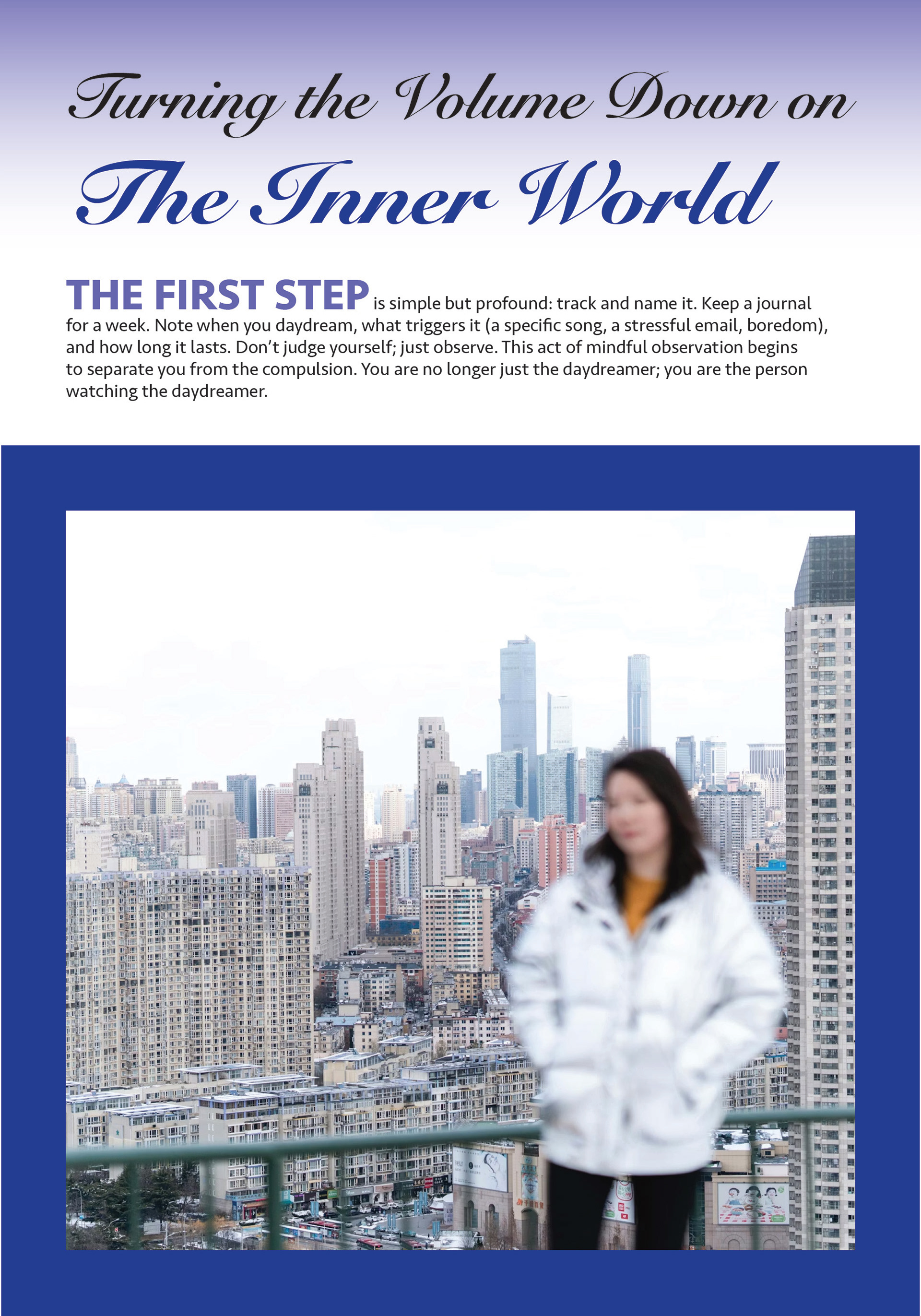
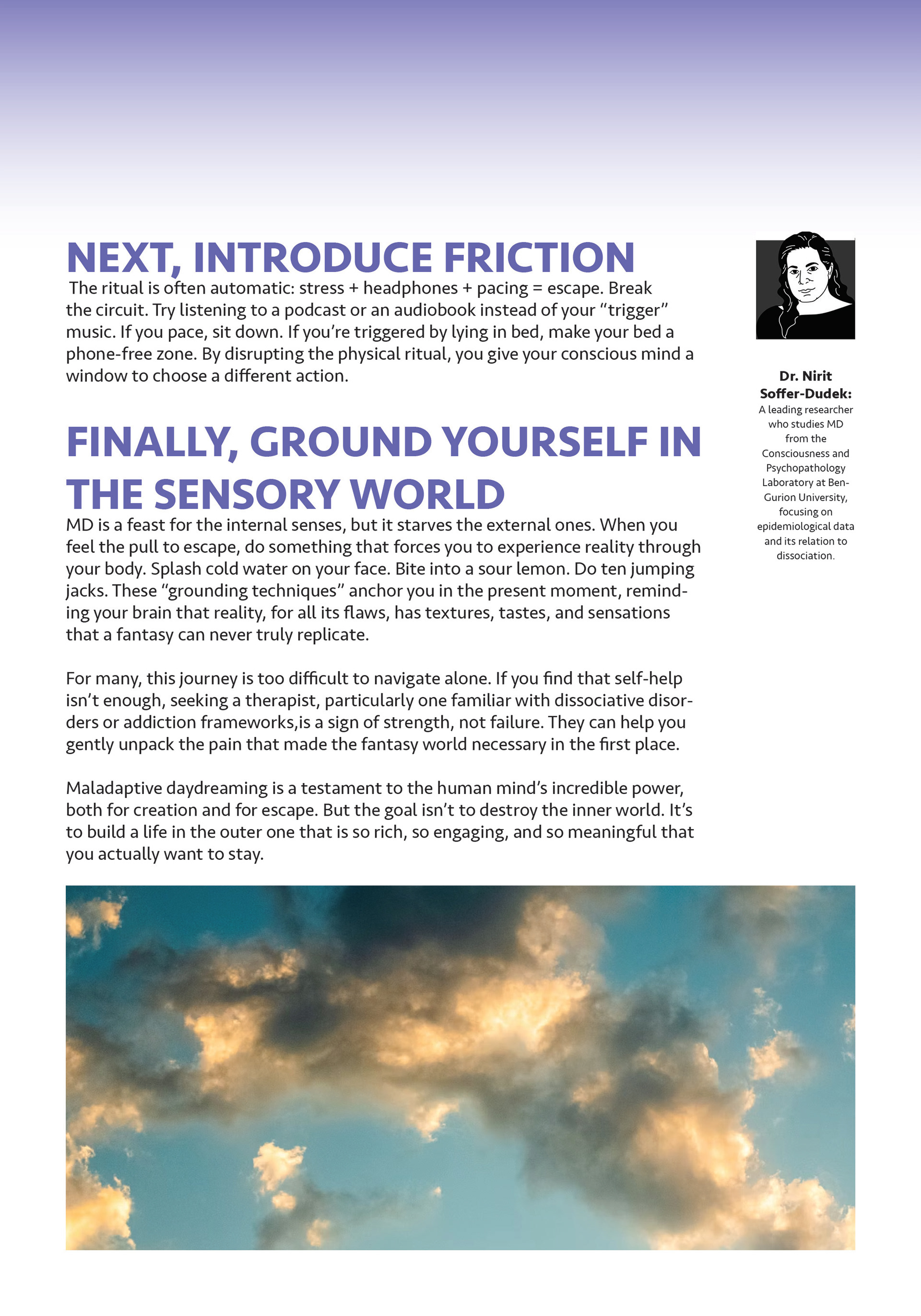
My primary aim was to create a digital magazine spread that educates, validates, and empowers. I wanted the article to clearly define Maladaptive Daydreaming (MD), share prevalence data (2.5% of the general population, up to 8.5% of young adults), and explain why MD is not just “laziness.” I also wanted to validate readers by using compassionate, first‑person language and a real‑sounding case study (“Anna”) so that people recognize themselves without shame. I knew that many people cope by escaping into fantasy, because I did the same thing during COVID. I wanted to give those people a way to understand themselves and a path forward. Finally, I wanted to empower readers by ending with four actionable steps: track triggers, introduce friction, ground in the senses, and seek therapy. Secondary aims included integrating simple data visualizations, using a calm color palette, and ensuring the layout never felt clinical or cold.
Research: What Choices Shaped My Design Research?
I am not a clinician, so I relied on peer‑reviewed sources to ensure accuracy. I began with Eli Somer’s original 2002 definition of MD, then moved to the 2022 prevalence study by Soffer‑Dudek and Theodor‑Katz. For understanding the cognitive impact, I used the 2026 study by Meidan and Soffer‑Dudek on memory and self‑concept disruptions. A 2024 CBT case study showed me concrete evidence that MD symptoms can be reduced. I also reviewed 2025 papers on trauma and dissociation to cover root causes, and I spent time on online peer forums such as Reddit and the Wild Minds Network to capture authentic trigger examples and language. These sources shaped my content hierarchy: prevalence data early to normalize the experience, cognitive research next to explain “why it matters,” and finally action steps to offer hope. I designed for three reader personas: the young adult who daydreams excessively but has no name for it, the concerned friend or family member who wants a clear explanation, and the health or design professional who looks for research credibility and clean information design. I also analyzed editorial spreads from Scientific American, Elemental, and AIGA Eye on Design to understand how to use white space, place pull quotes, and integrate data visualizations without overwhelming the text.
Key Design Aspects: Visual Language and Tone
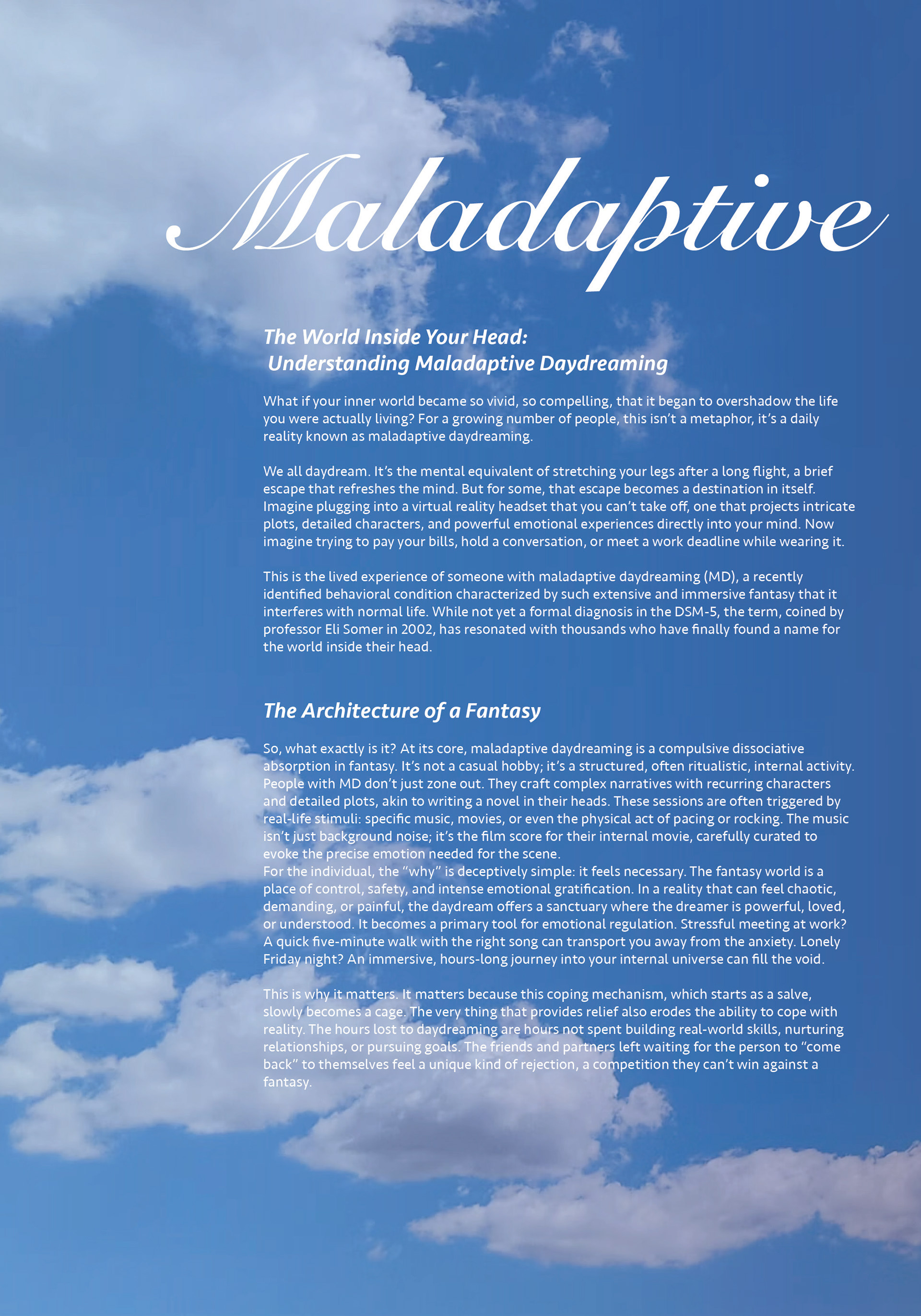
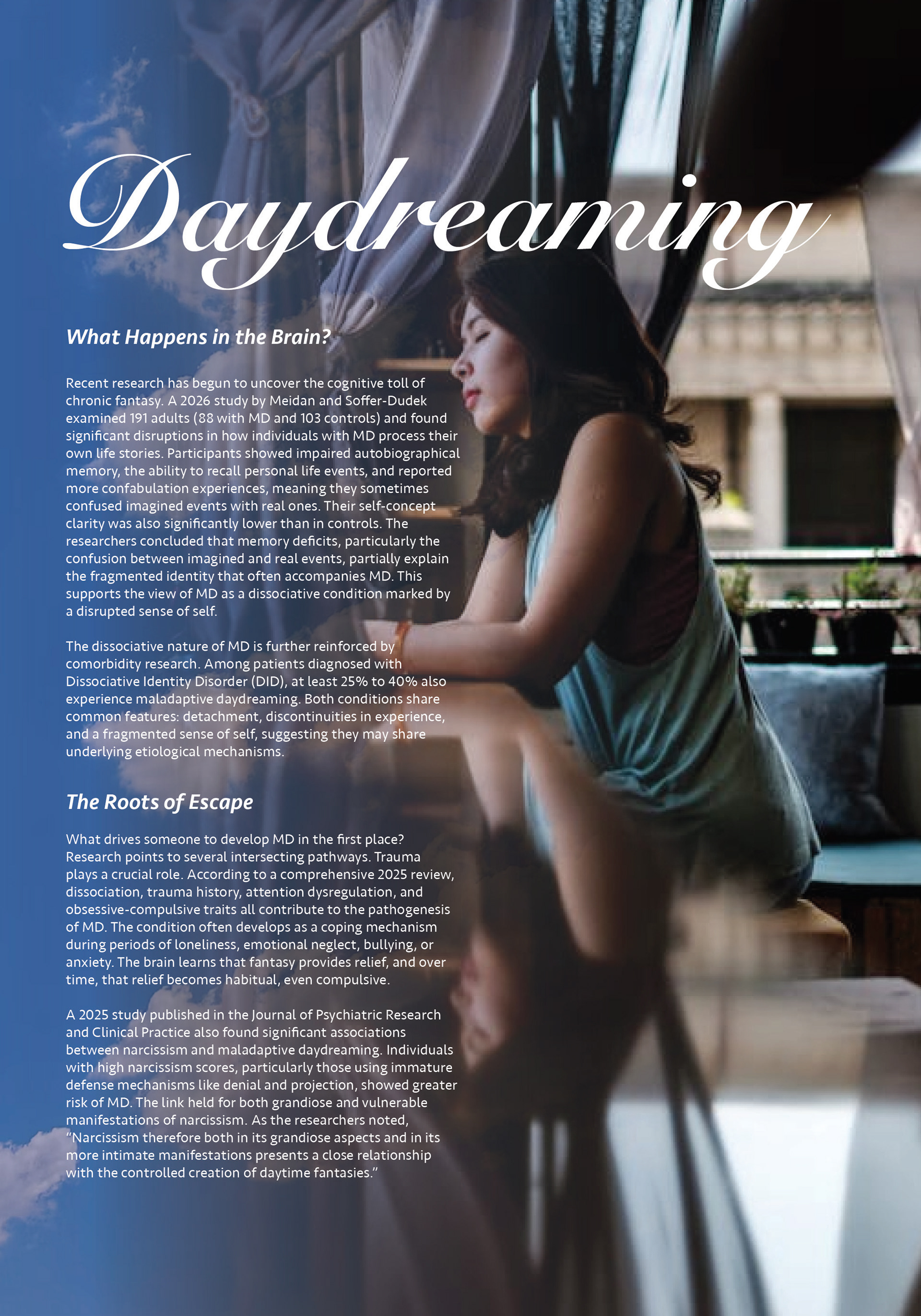
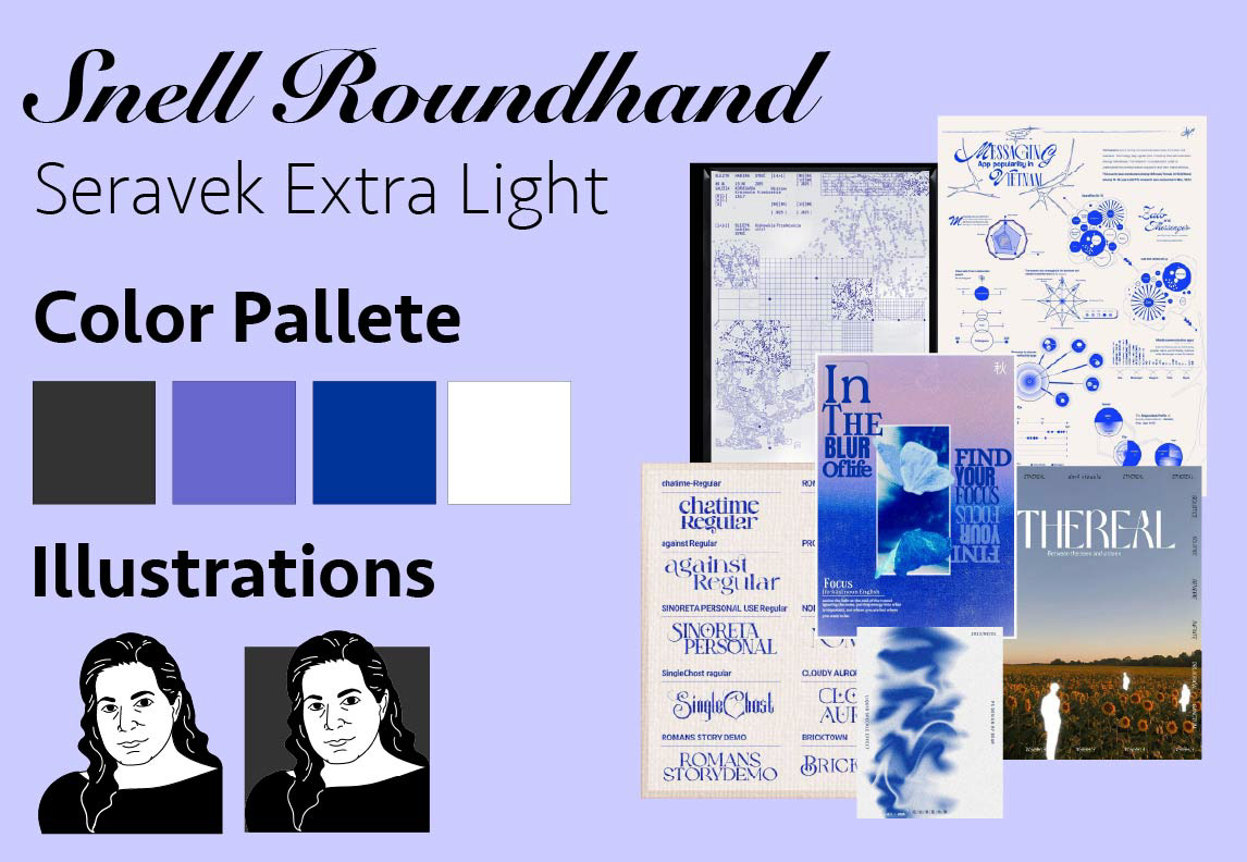
For typography, I chose Seravek (a bold sans‑serif) for headings and body text because it feels confident and modern, and Snell Roundhand (a decorative serif) for big title text because it is warm, readable, and slows down the reading pace. The color palette starts with an off‑white background that is soft and reduces eye strain. Primary text is dark charcoal high contrast without harshness. The accent is a muted teal that feels calm, introspective, and healing, while a pale peach is used for callout boxes such as the “Turning the Volume Down” sidebar. I chose these colors because they do not scream; MD is a quiet, shame‑filled experience, and the palette whispers you are safe here. For layout, I used a two‑column responsive grid for desktop that collapses to a single column on mobile, with wide margins to create breathing room around research data. I placed pull quotes asymmetrically sometimes spanning both columns, sometimes inset. The tone is first‑person plural (“we”) in the opening to build shared experience, jargon‑free (every clinical term is immediately explained), and built around empathetic imperatives like “You are not alone” rather than “Patients often experience…”
Process: How the Design Evolved Over Time
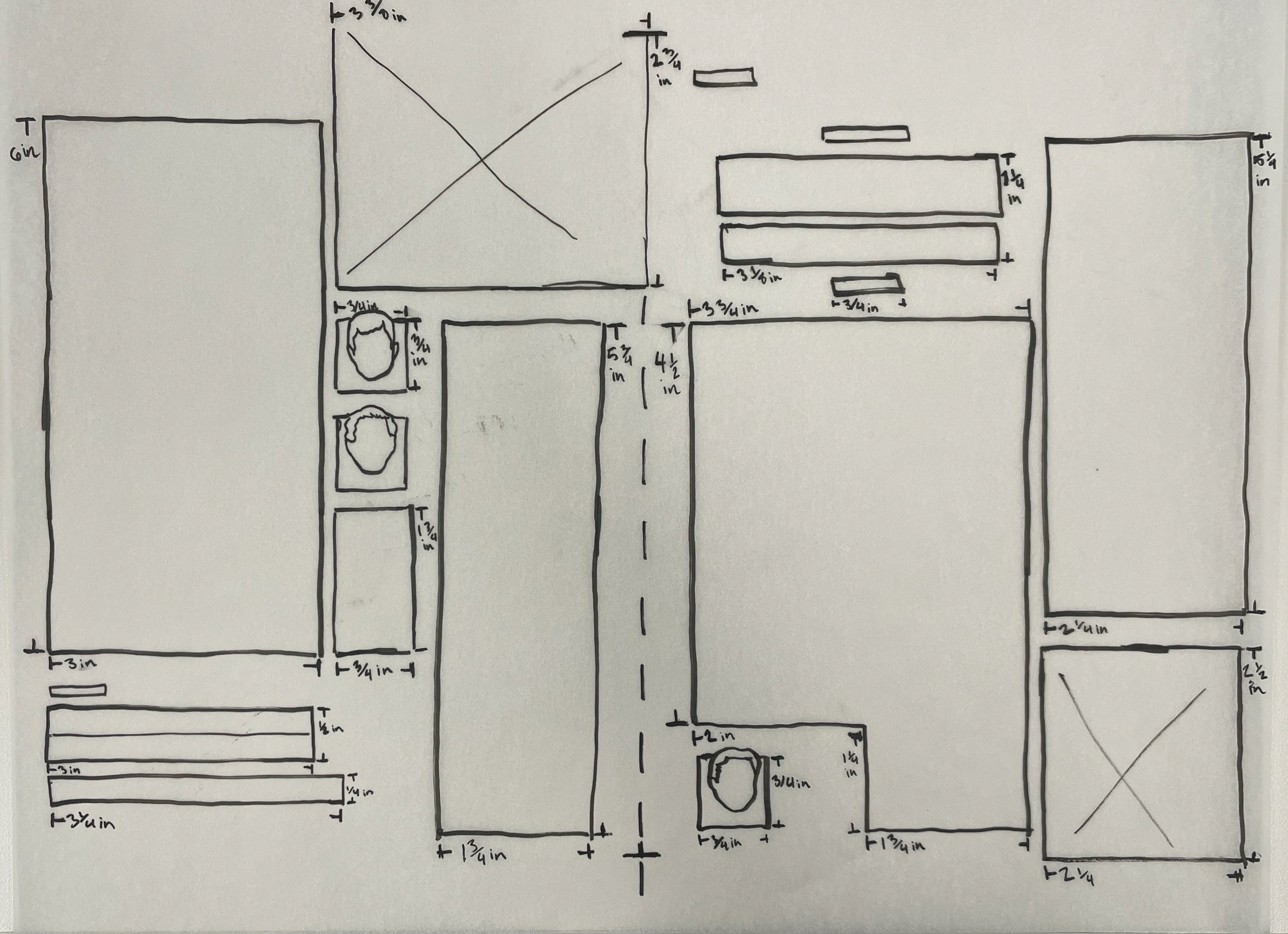
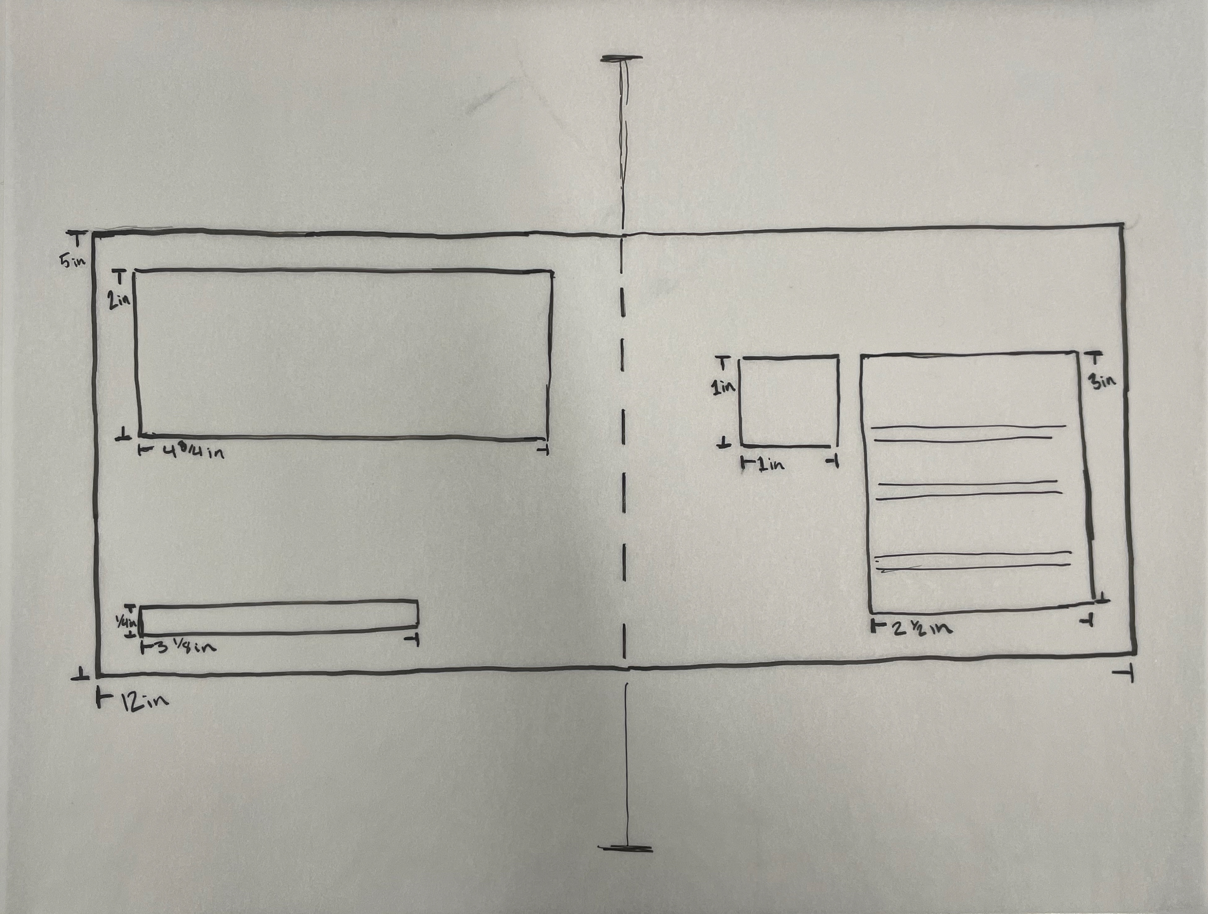
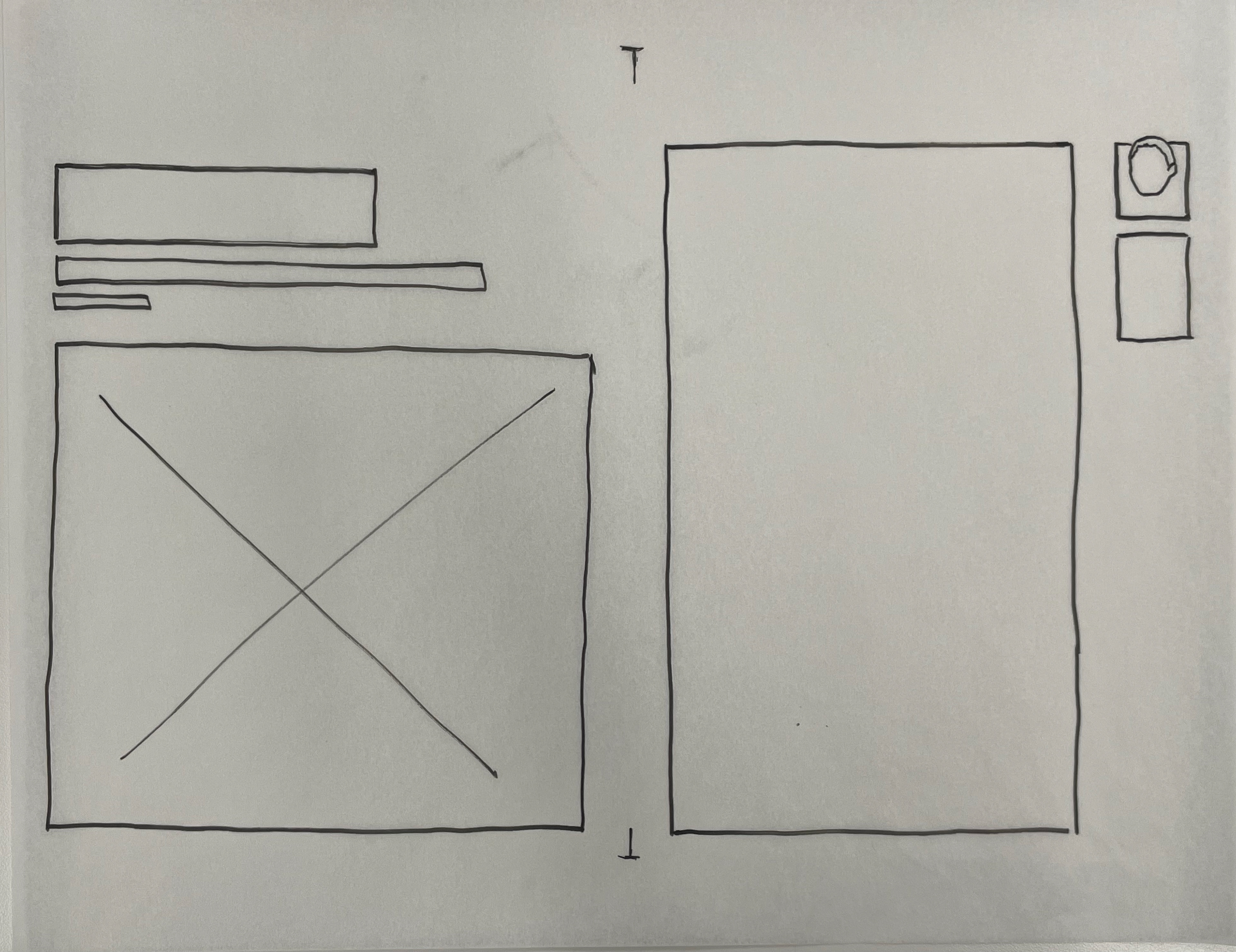
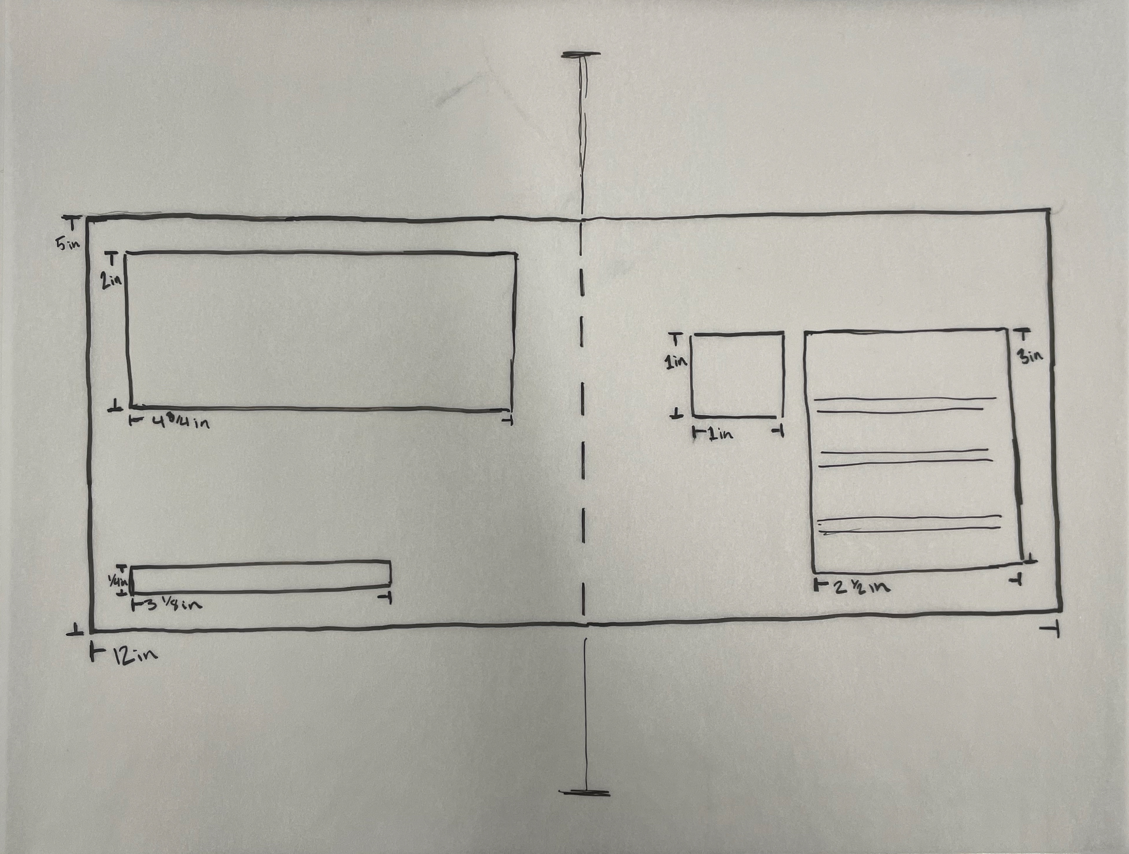
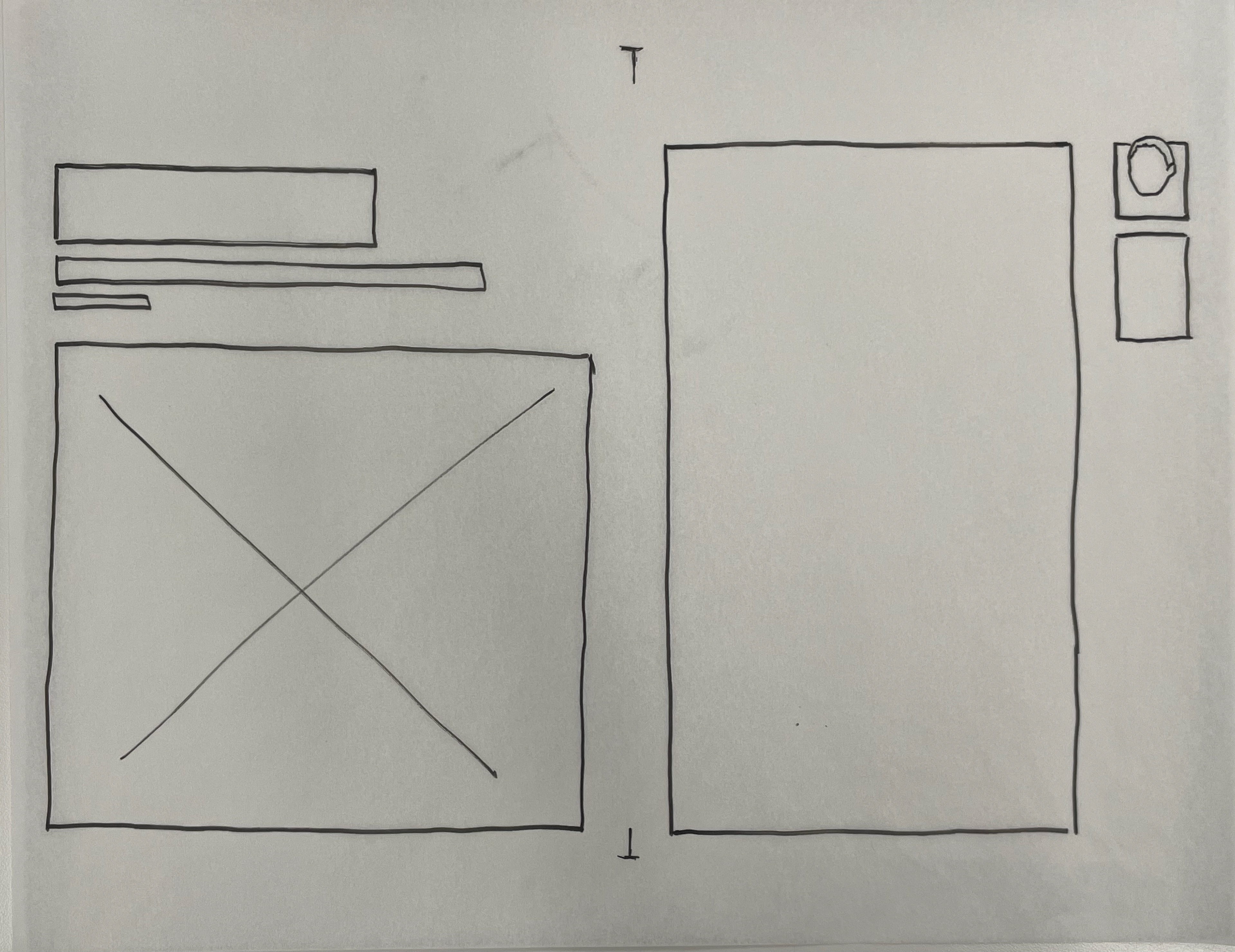
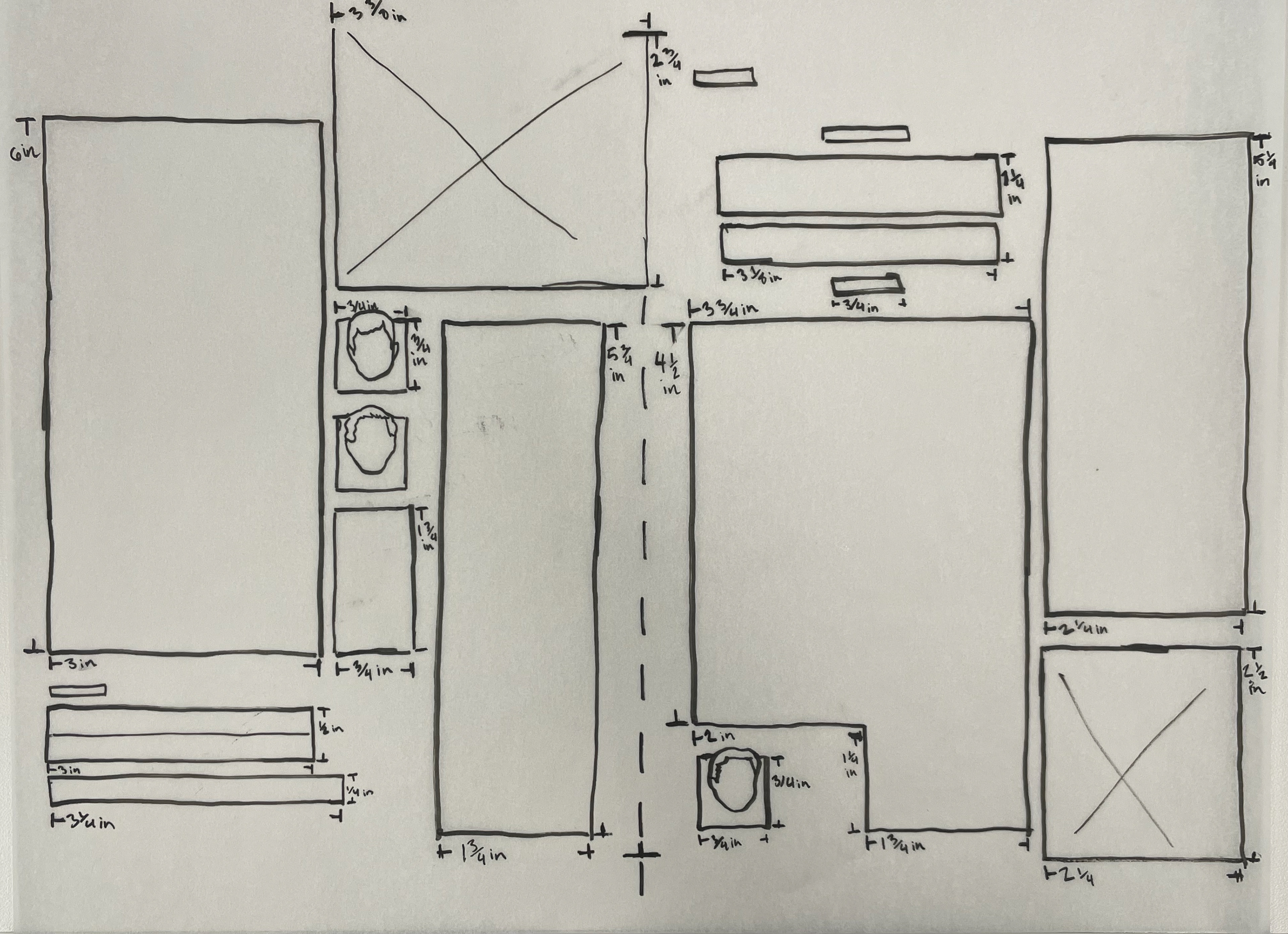
I worked through four clear phases. During weeks one and two, I wrote a rough draft of the article based on my research and then created a content map: introduction → definition → why it matters → prevalence → cognitive effects → root causes → actionable steps → conclusion. That map became my layout blueprint. In week three, I moved to Adobe InDesign for low‑fidelity wireframes, sketching three layout directions: a traditional single‑column longform with sidebars, a two‑column magazine style with pull quotes interrupting the text at golden‑ratio intervals, and a “scrollytelling” design where data visualizations appear as the reader scrolls. I chose the two‑column magazine style because it felt most appropriate for a print‑inspired digital magazine professional, calm, and easy to scan and because it honored my mother’s lesson to work harder on every detail. In week four, I built mid‑fidelity mockups with placeholder text and provisional charts. Feedback from peers (design students and a mental health counselor) pointed out three issues: the prevalence chart was too small, the action steps were buried in the final two paragraphs, instead of a featured element. During weeks five and six, I made high‑fidelity refinements and was able to get my finalized design.
Outcome: What Improvements Led to the Final Layout Solution?
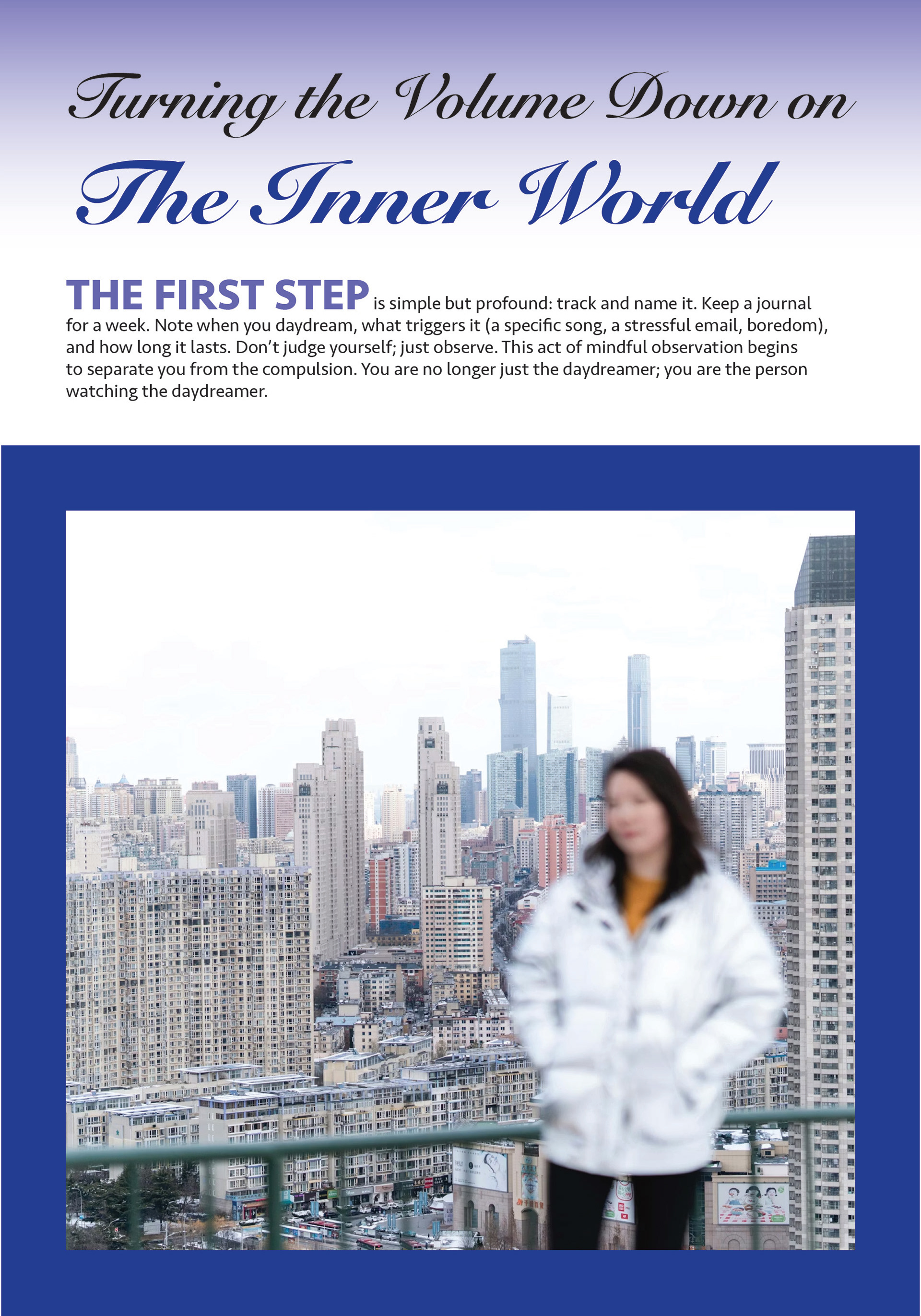
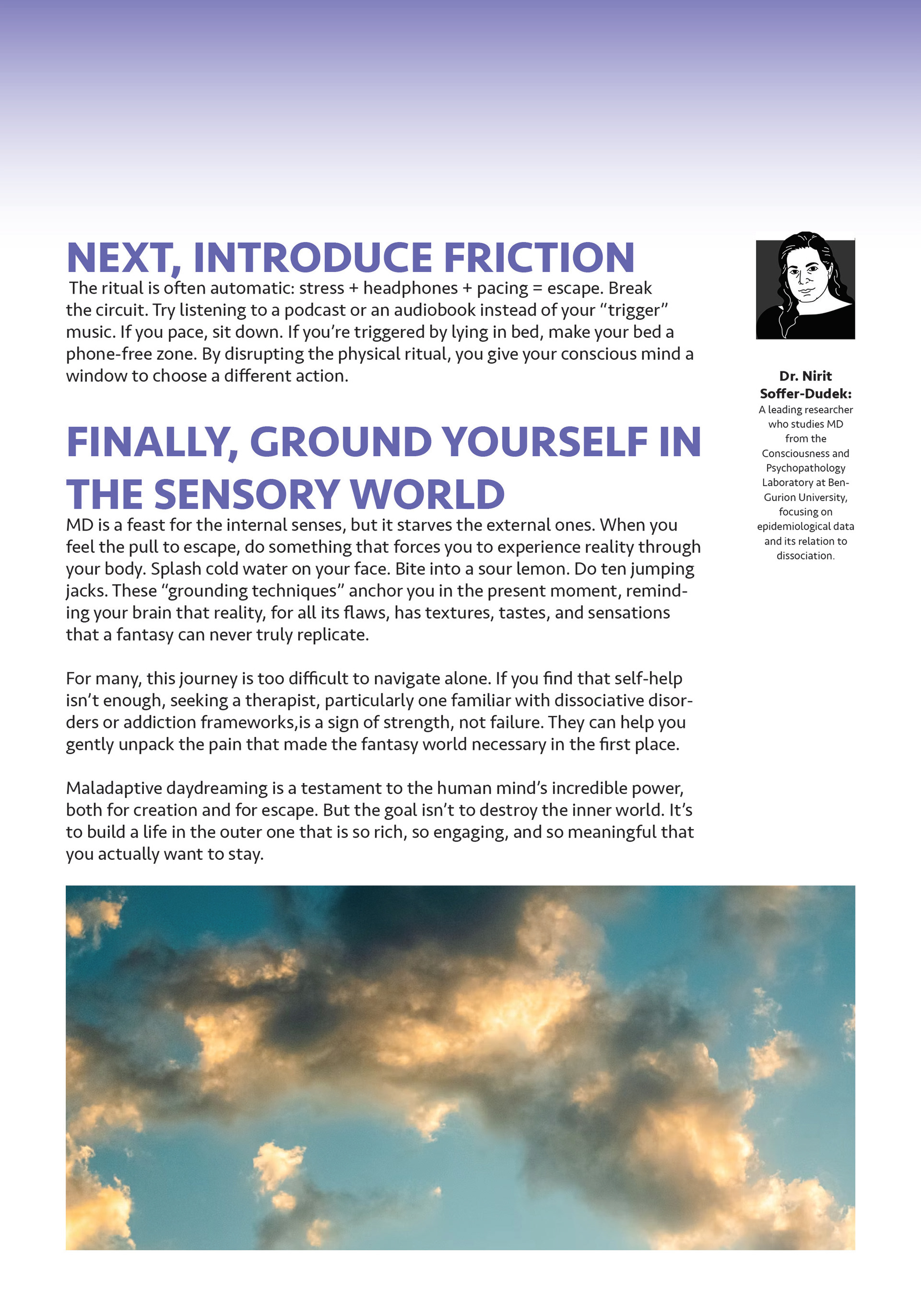
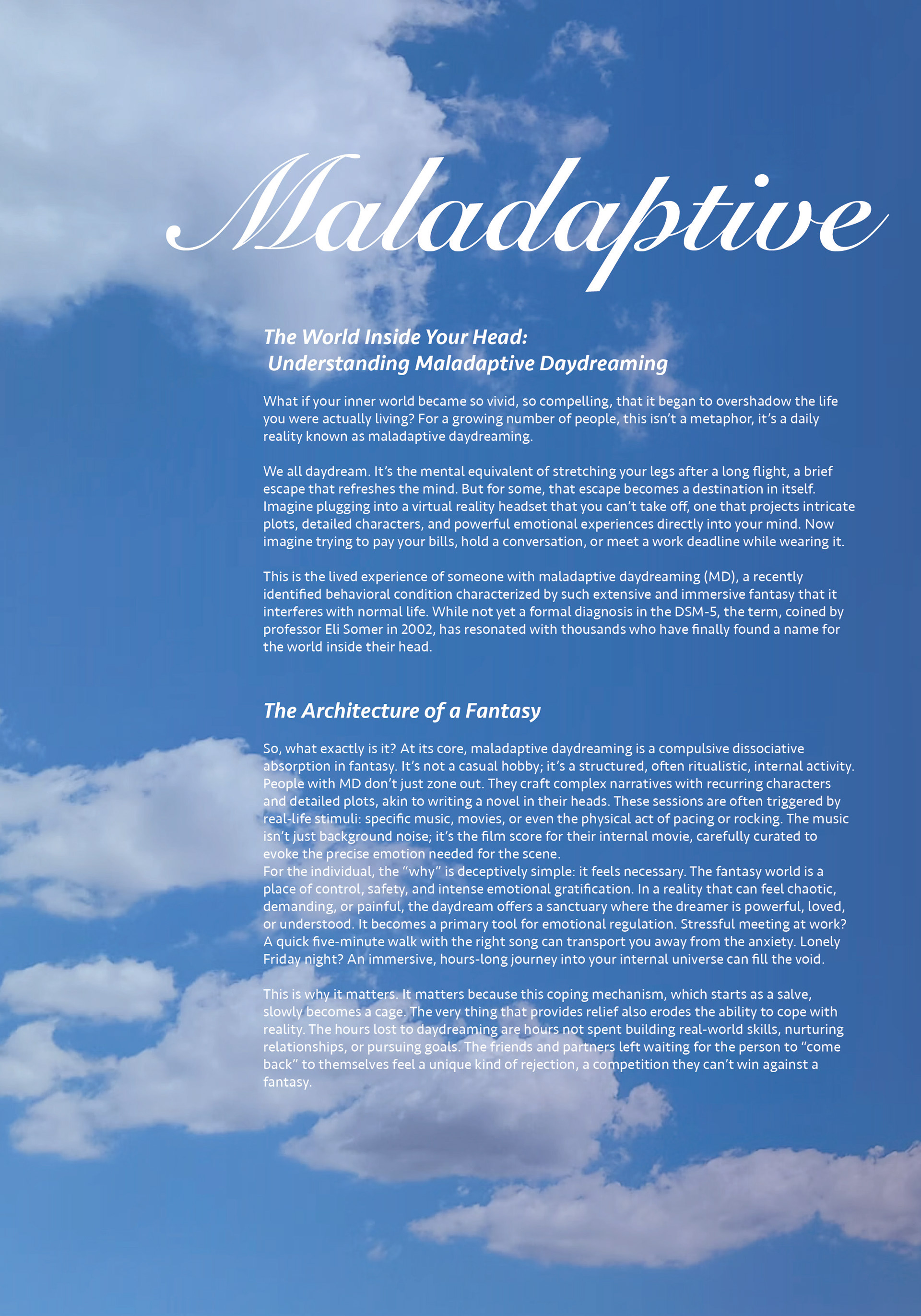
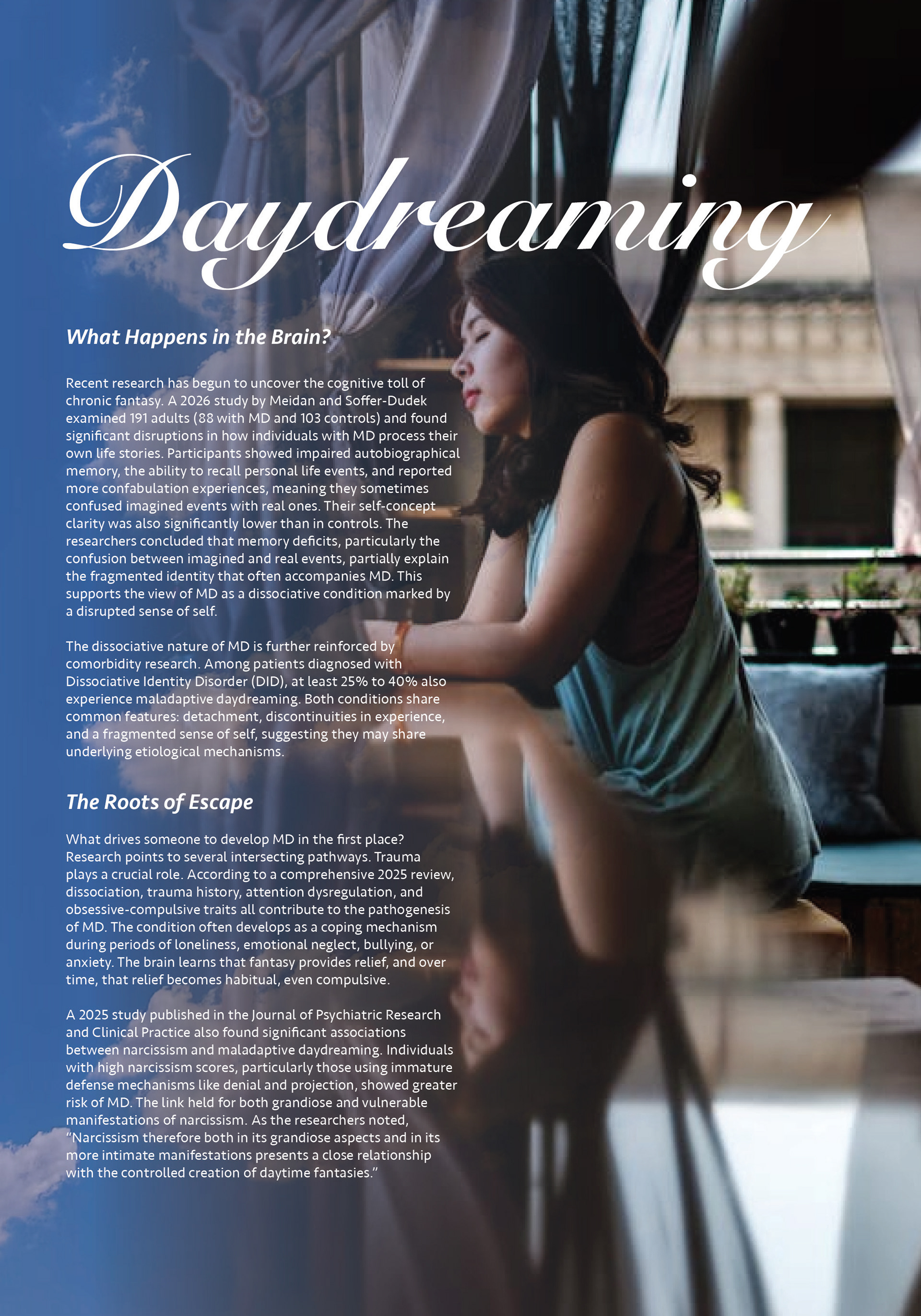
The final layout includes several key elements that work together to serve the reader. A hero spread displays the title, my author credit, and the first paragraph. I consider the layout successful for several reasons. All statistics are visually emphasized but never divorced from their source, I included small inline citations. Accessibility is high, with strong contrast, at least 16px body text on mobile, and alt text for all charts. The pacing silhouette illustration and soft color palette reduce the shame often associated with MD. Most importantly, the final third of the layout is dedicated to “how,” ensuring readers leave with practical tools, not just awareness.